Best. Mascara. Ever

Tuesday, September 22, 2015

More Bird Crazy Cards

Does anyone else make cards but then not send them?  I've been a little bit obsessed with making cards with the Bird Crazy stamps - but I am bad about sending them!  Another item to hoard?  Hopefully not!

I have been using up tons of tags that I made when I was practicing a new technique.  I didn't want to throw them out, but I wasn't sure how to use them on a card or project.  May Flaum (www.craftwithmay.com) to the rescue (again).  I took the "Camp Scrap" classes this summer, but didn't get through all of the lessons until now (she provides a lot of content!).  Some of the lessons in the technique section focused on getting those tags used.  So I am feeling good about getting them onto cards.


Having all of the painted tags on hand and ready to go, makes the card background come together really fast.  I tore 6x6 paper pads for the middle layer and picked a coordinating paper for the background (then adhered to a pre-made white card from Michael's).  The birds take a little more time, but are so much fun to make it seems easy.  The birds all have 3 dimensional pieces (wings, eyes, beak, accessories) which really make a huge difference with the final product - hard to see from the pictures I took.  

Hope you can have some fun making something today!

Leslie

Monday, September 21, 2015

Stencils & Spray Mist

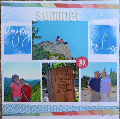
It's been fun pulling out messy products and just playing.  I did not have a plan when I started, so I was happy when this turned into a completed layout!

I used Heidi Swapp stencils and sprayed Dylusions spray mist and crossed my fingers that it wouldn't get everywhere!  It has a little messy (or should I say, "artsy") look to it.  After I added the paper strips and stickers, I intentionally splattered a few drops of the blue ink to tie it all together.

It was a pretty quick and simple layout, but I am pleased with the results.


Hope you can play with some artsy items today!

Leslie

Thursday, September 10, 2015

Joined the Crazy bird craze

So I resisted those darn Tim Holtz "Crazy Bird" stamps for like a year (Ok, so they probably didn't even hit the shelves until January 2015... but it felt like forever) and then they came out with accessories for the birds and I couldn't resist any longer.  The birds are just so cute and fun to color and stamp and "accessorize!"


I happened to have some hot pink crepe paper strips on my desk and it just screamed to be made into a tutu for the bird.  I was hand cutting the birds, but there was a die set for them and my sweet husband encouraged me to get it - what a difference! (Yay Stamp Asylum for always having just what I "need").  The detailed cuts are awesome.  I can't wait for the die set to come out for the accessories - I'm still cutting those out by hand (balloons, hat, present, flowers, hearts... bunny ears, paint brushes, candy canes etc!).

I need to figure out how to make cards in a more standard fashion so that each card doesn't take me hours to make!  Each piece was pretty fast to  make, but I had a hard time figuring out how to put it all together!  I think I've got it now.

Now I see why everyone was blowing up the internet with "Crazy Bird" images!

Hope you can get crazy today!

Leslie

Friday, July 17, 2015

Monochromatic

Well, I'm not sure if this is technically "monochromatic" - but it was inspired by a prompt from CampScrap (www.CraftWithMay.com) by May Flaum.  (Have I mentioned how much I like her style of video, her layouts and her willingness to just go for it?)

I chose a neutral background and then used scraps of green and brown papers ( either from 6x6 paper pads or literally from my scrap bin) and made this two page layout of one of our trips to Acadia National Park in Maine.  One of my favorite places in the world!  I added wood veneer birds and buttons to add a little interest.  I kind of forgot to leave room for my journaling, so I hid it in a pocket behind a picture.  I could have done some stitching to add some texture, but I decided to go with simple instead! (read: lazy)


It's a fairly simple design, but I am pleased with the results.  

Hope you can take it easy (be lazy) today!

Leslie

Tuesday, July 14, 2015

A little sparkle

My son had the opportunity to travel to China with a friend (and his family)  three summers ago.  I haven't quite finished these layouts because I want to confirm the journaling with my son.  I know I want to write about the unusual things he ate (and liked) and some of the more personal stories from his trip.  So I have left a large journaling block to accommodate that story.  I scrap-lifted this layout from May Flaum in one of her classes.  It works really well for a lot of pictures and/or journaling.  You can just make the center block an embellished title and that works well too.


This next layout is also about his trip.  I used gold paint with a stamp to create a background and then I cut the butterfly images from a piece of scrapbook paper.  I added a little stickles to the butterfly wings to add a little sparkle and a few sequins too.


I just need to add the journaling and they are done!

Hope you can create something with sparkle today!

Leslie

Sunday, July 12, 2015

Summer Fun

I've been having fun playing with lots of different techniques - spray misting, stenciling, layering, watercolors - you name it.  The trouble with having such a plethora of techniques on the brain is that sometimes it is hard to settle down and just pick one to focus on!  I get stuck staring at the papers and pictures imagining all of the different possibilities and therefore, get absolutely nothing accomplished.  I need to learn to just pick one and move forward and not look back!

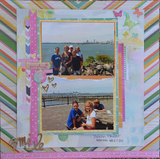
Here is a summer layout I did about one of our excursions in Boston.


I love the bright summer colors and had fun mixing in some watercolors in the background and some stencils with Tim Holtz distress inks for some texture.  I layered papers (mostly from my scrap bin) and even did a little stitching on the page.  Glued down and done!

Hope you can move forward with a project today!

Leslie

Friday, June 26, 2015

Feeling Artsy

I don't think "artsy" is a word, but I'm using it anyway.  I enjoy trying different techniques for my scrapbook layouts.  Sometimes I like clean and graphic layouts and sometimes I want to go for a more messy, creative look (a.k.a. "artsy").  I have been following Missy Whidden's blog (http://littlenuggetcreations.blogspot.com) and love her designs.  This is my version of her style:


Watercoloring the background (with the "smoosh" technique - paint some leftover plastic packaging and "smoosh" it onto your background), stenciling, stamping, layering papers and adding lots of embellishments - so fun to make!  Sometimes getting messy helps get the creative process going.  So if you haven't gotten your fingers inky or your desk splattered with a little paint recently - give it a try.  Go ahead and get a little "artsy" - haha.

Hope you can get messy today!

Leslie


Blog Design by Delicious Design Studio